Bayern Munich, Manchester City, and More: Ranking the 5 Worst Football Jerseys of the 2025/26 Season
- Bayern Munich and Manchester City have been ranked among the clubs with the ugliest jerseys for the 2025/26 season
- Poor badge placement, clashing colours, and oversized logos are some of the criteria used to rank the jerseys
- The 2025/26 season is set to kick off with Liverpool, Bayern Munich, and Barcelona set to defend their titles
The new season should be a time of optimism and hope, but nothing destroys your excitement quite as quickly as your club releasing an absolute stinker of a kit.
Football jerseys are part of a club's merchandise that interests fans as their usefulness goes beyond just wearing to watch matches in the stadium alone.

Source: Twitter
These days, jerseys have been worn to dates, concerts, beaches, and even picnics as the beauty of the kit determines which occasion it can be worn to.
Now imagine the disappointment when your favourite team unveils one of the worst jerseys for the upcoming season. Disappointing right?

Source: Twitter
Football clubs also generate massive revenue from jersey sales, with Galatasaray the latest to benefit after the signing of Victor Osimhen.
Here, Legit.ng has put together a list of the most disappointing jerseys for the 2025/26 football season, and some of your top teams are on it:
Top 5 ugliest jerseys of 2025/26
5. Sunderland – Home kit disaster
Sunderland’s return to the Premier League should have been a celebration, but their home jersey has dampened the mood.
According to Planet Football, the badge, placed centrally, is far too large, and the thick black outline only makes it less fancy.
The kit sponsor dominates the shirt so much that it covers the Hummel logo, creating a cluttered and awkward design.
4. Bayer Leverkusen – Washed-out away look
Bayer Leverkusen’s away jersey looks like it was a last-minute rush job from New Balance.
While the collar is serviceable, the shirt’s body gives the impression of a laundry mishap, as if a red sock was accidentally tossed in with the whites.
The result is a dull, blotchy colour pattern that fails to inspire confidence or style.
3. Bayern Munich – A rare misstep
Bayern Munich usually delivers beautiful jersey designs, but their 2025/26 home kit is a chaotic letdown.
The oversized Adidas and T-Mobile logos compete for attention, while the white stripes look half-rendered and inconsistent.
It’s a busy, unbalanced design that lacks the elegance fans expect from the Bavarian giants.
2. Manchester City – Third kit disappointment
Manchester City’s home and away kits are solid, but their third kit has left fans scratching their heads.
According to GOAL, Puma’s design choices are baffling, combining clashing colours and abstract patterns that do nothing for the club’s image.
It’s a bold attempt at creativity, but one that fails to land.
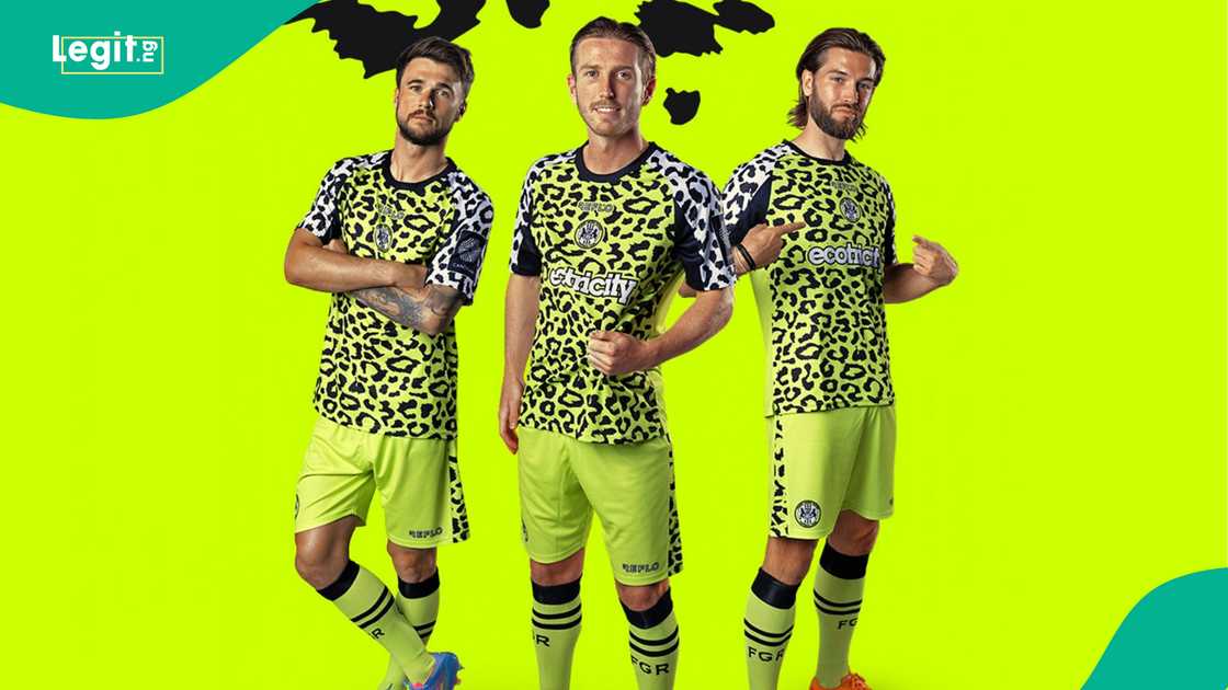
1. Forest Green Rovers – Double the disaster
Forest Green Rovers have a reputation for daring kit designs, but this year’s home and away shirts push things too far.
The patterns are overwhelming, and the colour combinations are difficult on the eyes.
Innovation is admirable, but this season, it's innovation gone wrong.
While these teams will hope their performances on the pitch outshine their fashion mishaps, for now, these jerseys will be remembered for all the wrong reasons.
Osimhen rocks Brazil’s 1998 World Cup jersey
In a related development, Legit.ng reported that Victor Osimhen rocked the No.9 shirt of Brazilian football legend Ronaldo Nazario de Lima in a heartfelt tribute.
Nicknamed O'fenomeno (The Phenomenon), Ronaldo's influence has continued to resonate with a new generation of players around the globe.
Source: Legit.ng


